Project type
Group Design Project (Course: LIS 470 - Interaction Design Studio)
Deliverables
High-fidelity interactive mockups and a UX case study
Tools Used
Figma
Responsibilities
- Conducted contextual inquiries and user interviews to gather insights
- Developed sketches, wireframes, and high-fidelity mockups
- Collaborated on prototyping and iterative design updates
Duration
8 weeks of part-time effort dedicated to the final project alongside other coursework
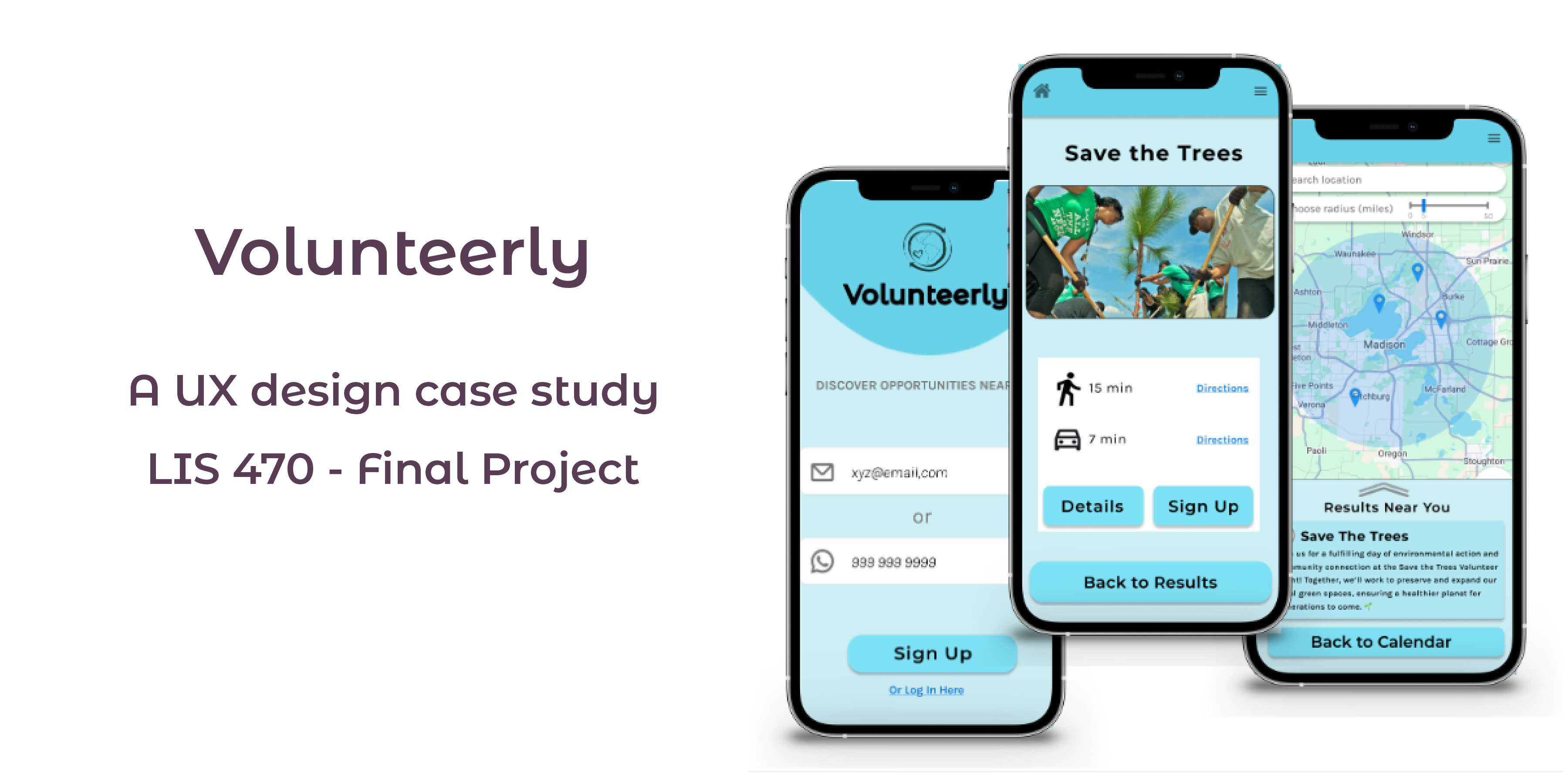
We designed a smartphone app called Volunteerly to make it easier for people to find local volunteer activities that fit their schedules, interests, and skill set. It can be difficult to locate worthwhile opportunities in the disconnected ecosystem of volunteer platforms available today. In order to address this issue through a human-centered design approach, our team, consisting of Nuzhat Tabassum Nawshin (me), Jenna Kraus, Zenghui Wang, and Ayesh Chandrasekera started this project during LIS 470: Interaction Studio in Fall 2024.
This project was a group effort conducted as part of an academic course. All design artifacts and solutions reflect the collaborative contributions of our team.
As a core team member, I actively contributed to every stage of the design process, including contextual inquiry, affinity diagramming, ideation, storyboarding, sketching, wireframing, prototyping, and final presentations. Specifically, I focused on synthesizing insights from users into actionable solutions and designing the interactice mockups.
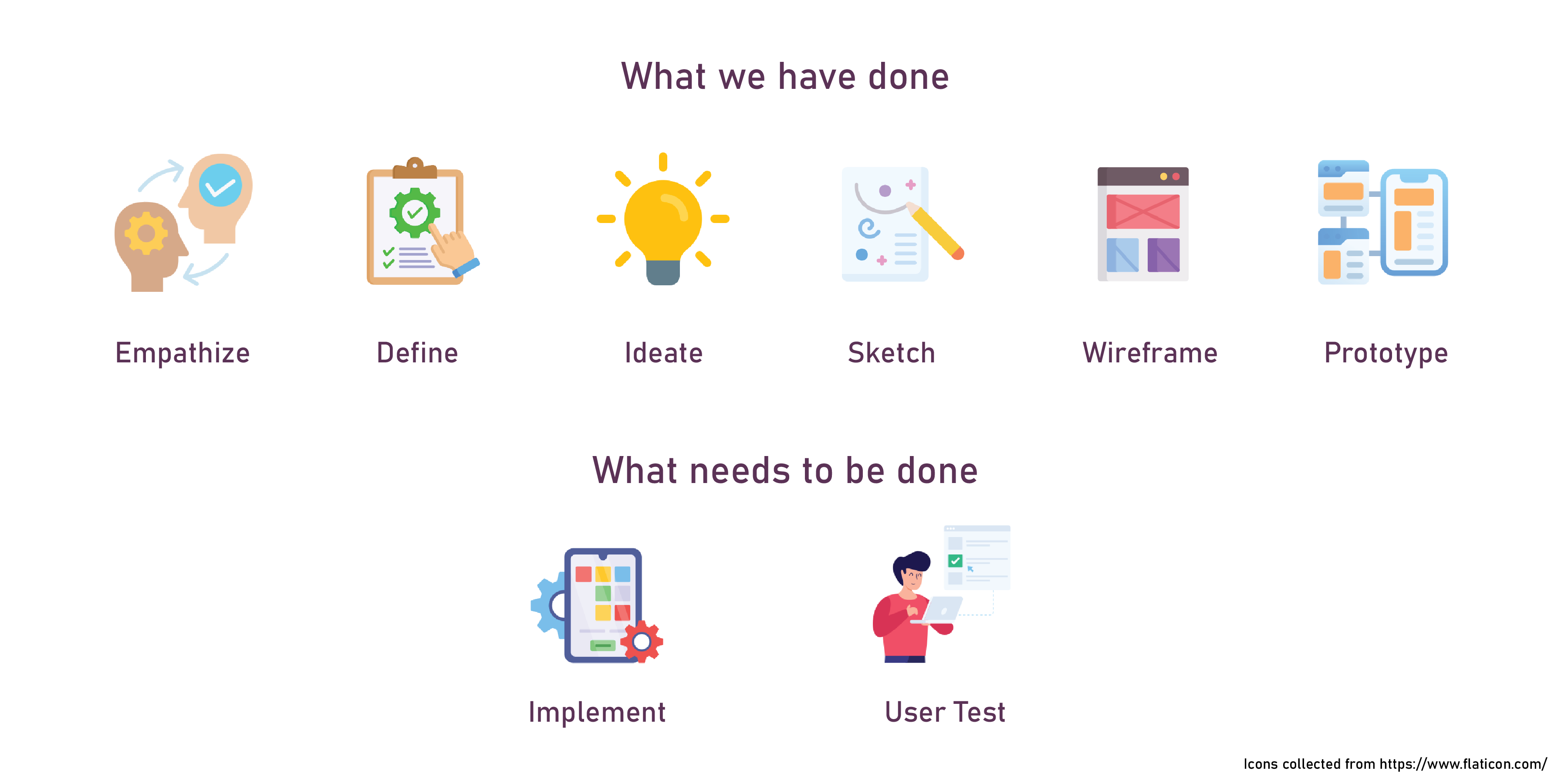
The final project was completed over 8 weeks of part-time effort, with weekly assignments covering one design stage per week, alongside other coursework. Our process followed the design thinking framework, moving through the phases of empathize, define, ideate, prototype, and test. This case study will narrate our journey, sharing the tools and methods we used, key design decisions, and the outcomes that shaped our final product.
Our goal was to understand the barriers individuals face when searching for volunteering opportunities and to uncover the features that would make this process more engaging and efficient.
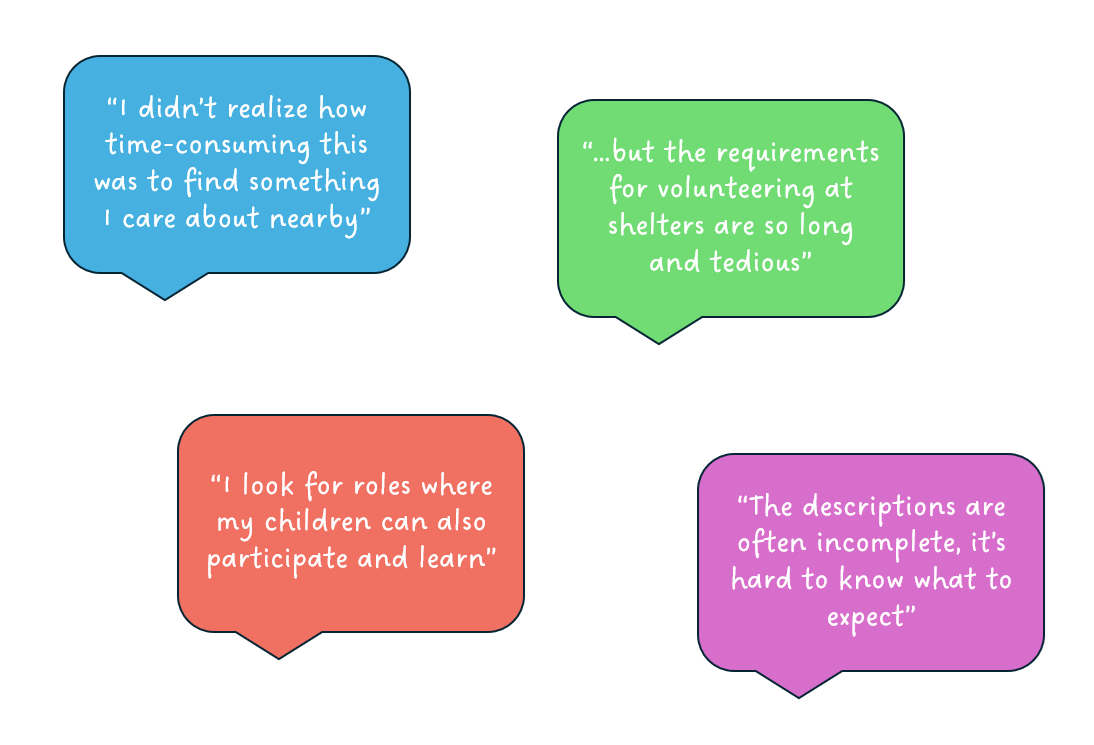
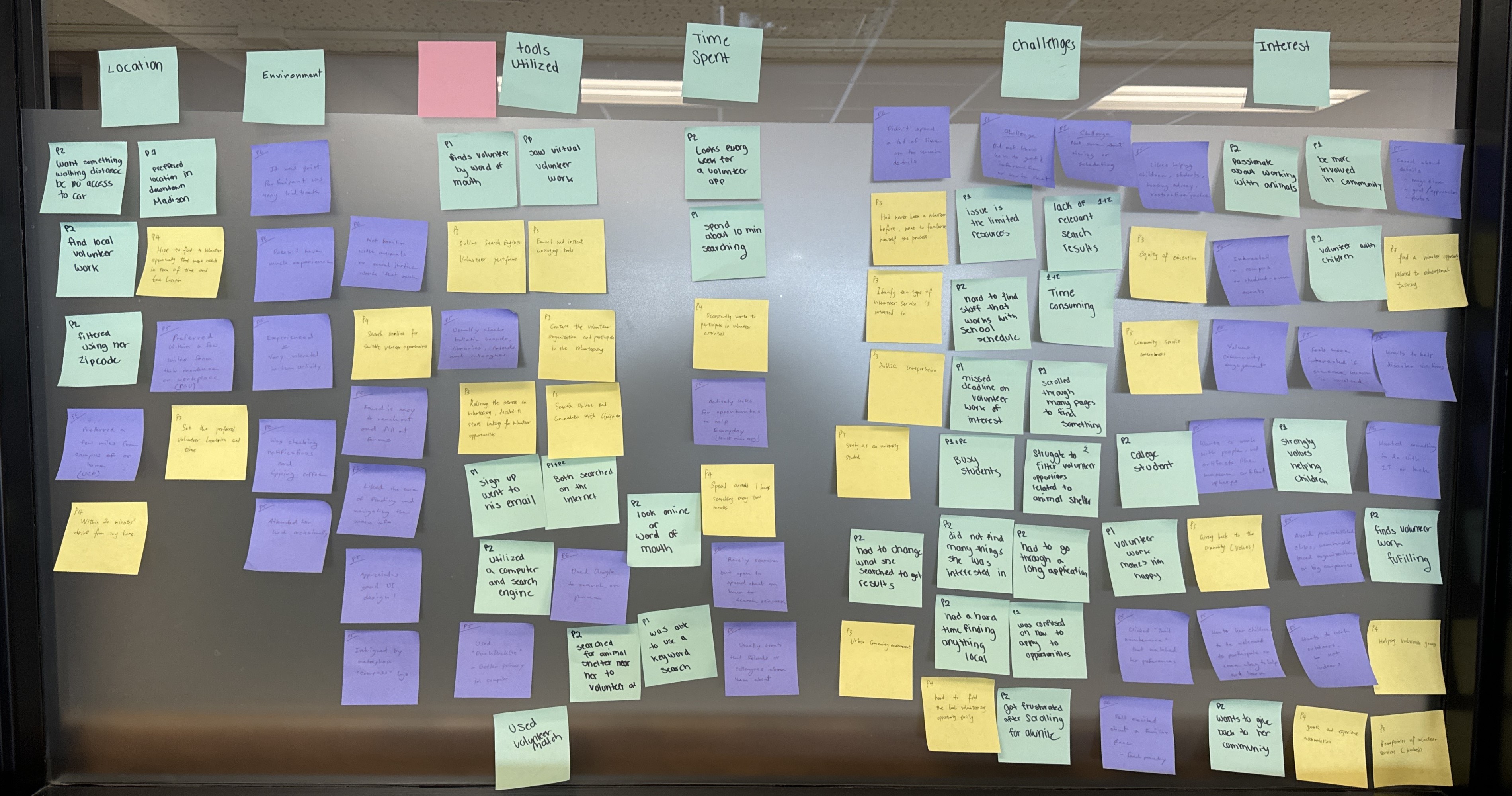
We conducted contextual inquiries with eight participants (university students from different backgrounds, age range between 20-30 years old) who are interested in volunteering for different causes. Through interviews and observations, we captured insights about their behaviors, challenges, and preferences. For example, users
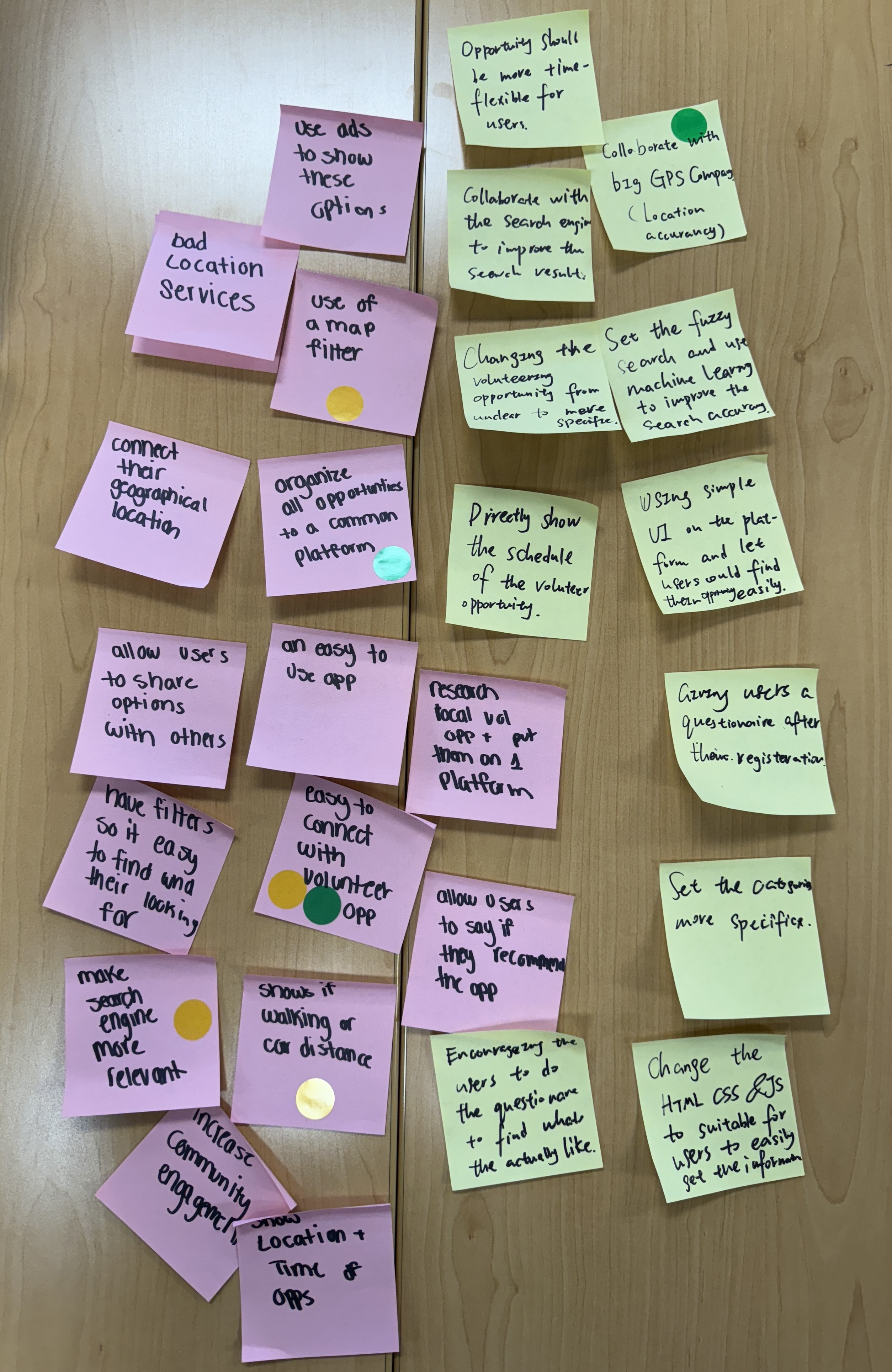
We made an affinity diagram to distill the five primary themes that emerged from our contextual inquiry:
New and existing community members seeking meaningful volunteer work need a user-friendly, personalized platform that provides clear role descriptions, flexible scheduling options, and opportunities to connect with others.
Using a needs statement format, we identified key user needs:
Our team permorfed a brainstorming session during the Studio session where we generated over 30 ideas using the "How might we..." prompt.
How might we make it easier for users to find local volunteer opportunities?
We narrowed our ideas down to three core solutions:
Each team member took one of the generated ideas and created three distinct sketches to explore different ways to develop the concept further. After presenting our designs to the group, we critiqued one another’s work and integrated the feedback into a final sketch for each idea. Here is a summary of our contributions:
Building on the sketches, each team member created a storyboard to demonstrate how users would interact with the proposed designs in real-life scenarios. These storyboards depicted user flows and highlighted key moments in the interaction process.
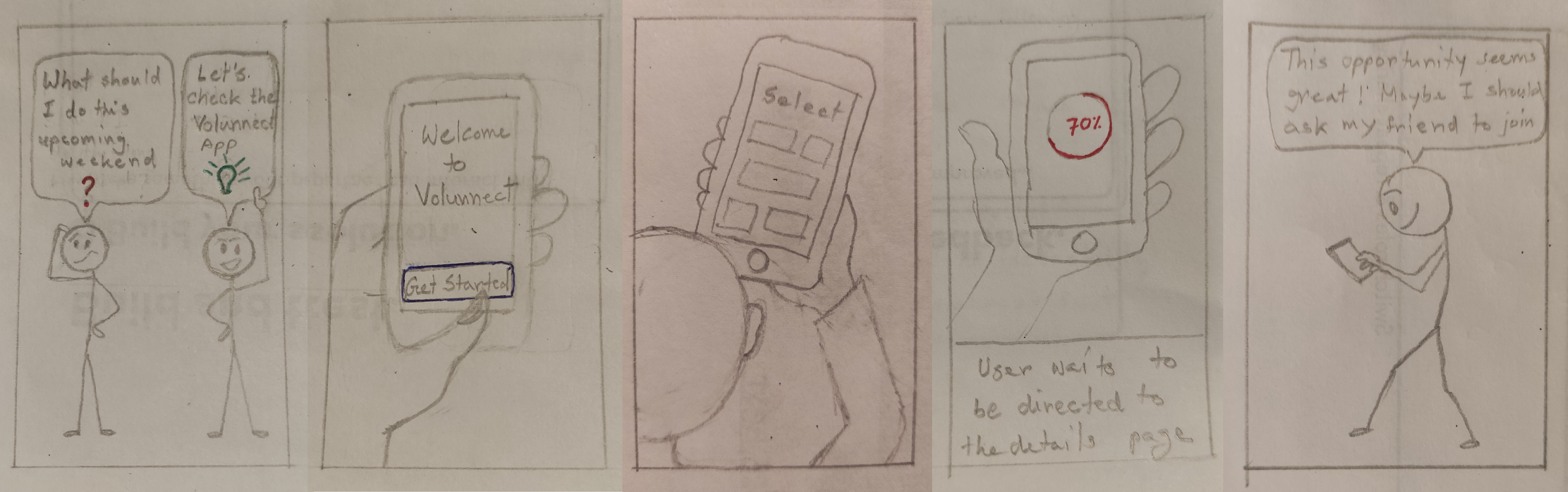
We each came up with our own paper prototypes and tested them with one person each. Then we collaborated on creating paper prototypes for the selected design ideas. These prototypes included:
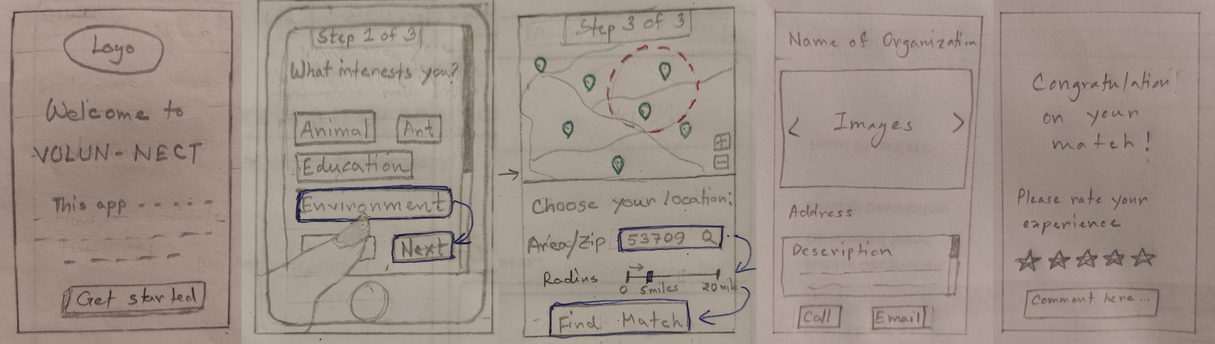
We identified areas for improvement, such as clarifying button placement and enhancing information hierarchy. These insights directly informed our next phase of work.
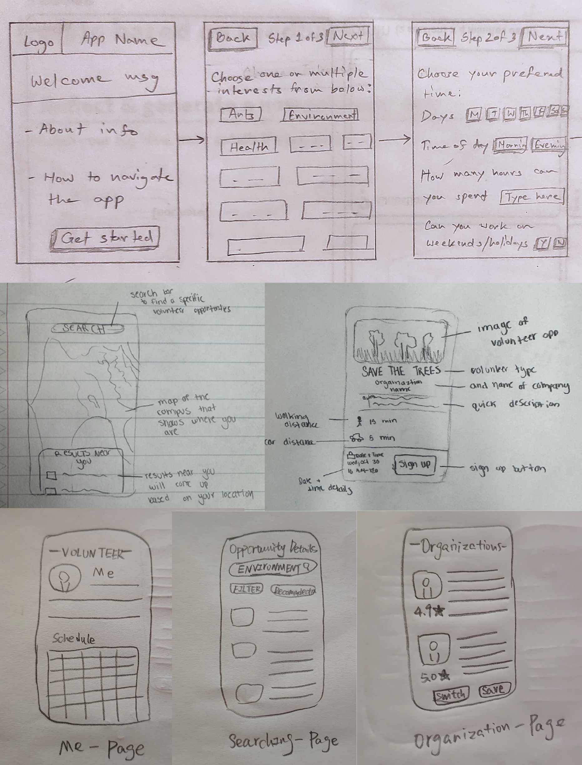
Following the paper prototyping phase, we transitioned to digital wireframes. Using Figma, the team collaboratively developed low-fidelity wireframes to refine the layout and structure of key screens:
We found the need for coming up with a consistent layout design, color palette, button designs, adding more screens in-between screens for improved navigation flow and adding back buttons for easier movement between screens for the interactive mockups.
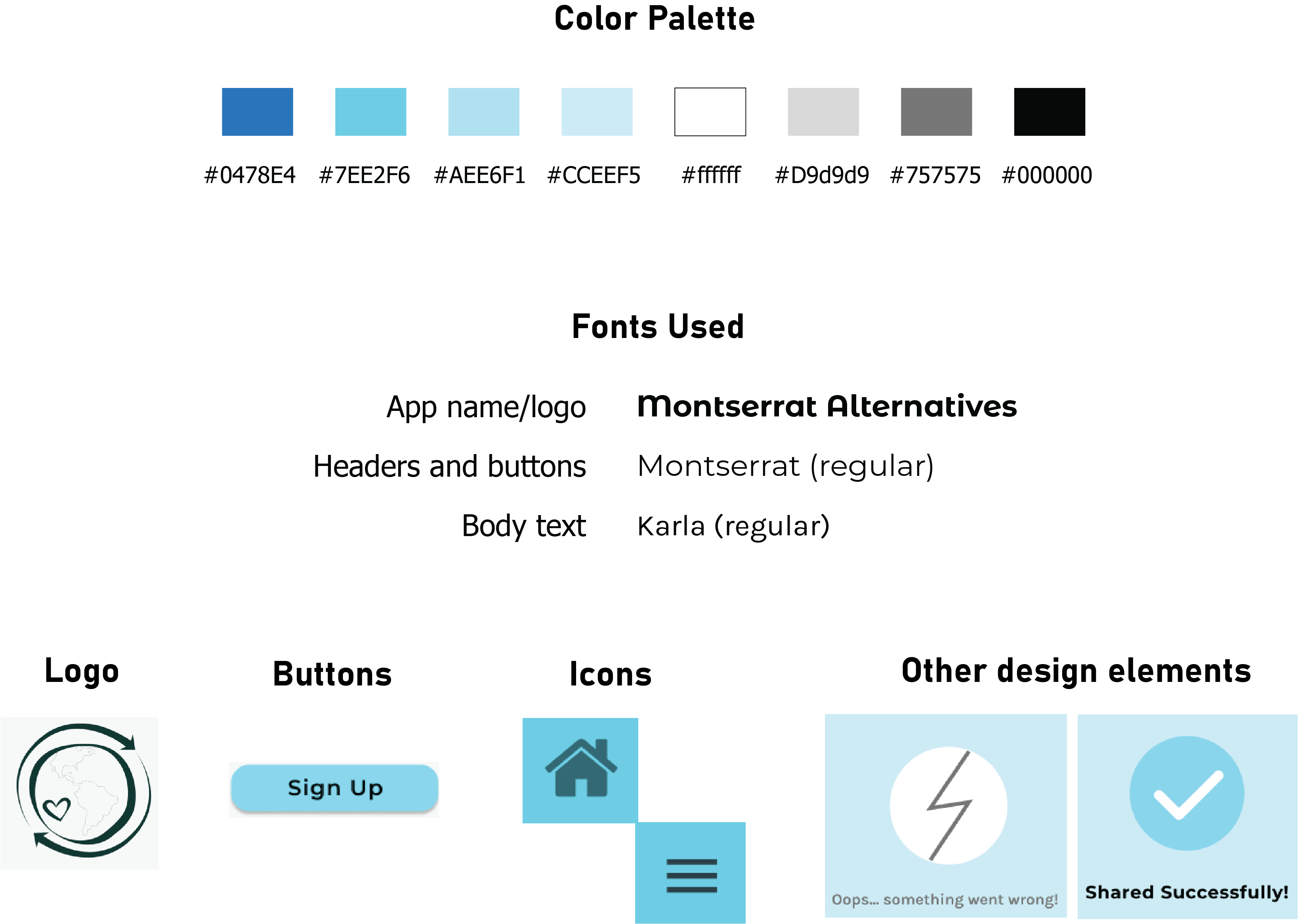
To ensure a cohesive and intuitive interface, we made several key design decisions before creating the high-fidelity mockups. We found a logo for the app and chose a name that indicates the app's purpose but is also welcoming enough. We chose a color palette that we all felt was soothing and energizing at the same time, having our braod range of target users in mind. The fonts were selected focuing on readability, with sans-serif fonts used consistently across all screens.
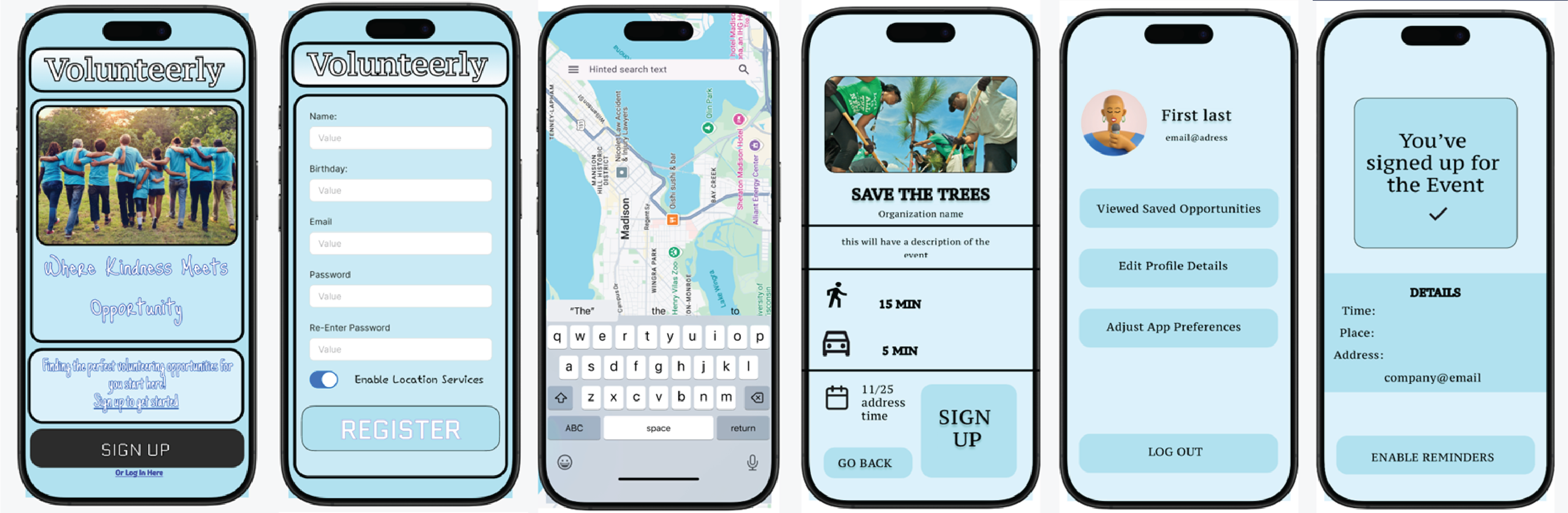
Using Figma, we transformed the wireframes into high-fidelity mockups, ensuring a polished and interactive user experience. Key steps included:
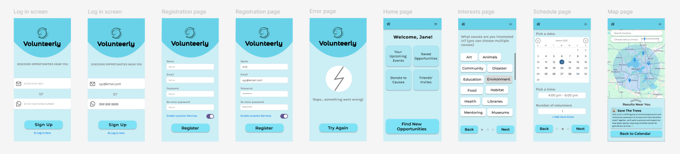
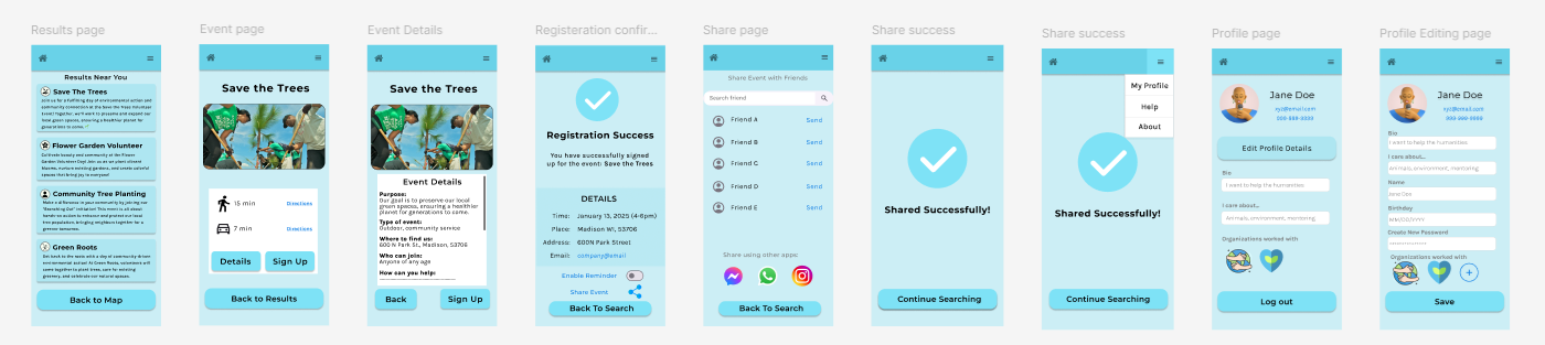
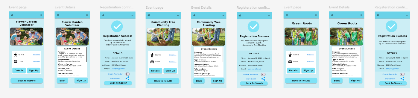
Using Figma, we transformed the wireframes into high-fidelity mockups, ensuring a polished and interactive user experience. Key steps included:
While we think the Volunteerly project currently addresses the basic user needs, there are several areas for future exploration and development:
About users: Volunteering decisions are often motivated by a sense of community and ease of access
About the design process: Iterative testing and feedback is invaluable for refining navigation and features
About myself: I got two major gains from this project: gained confidence in translating user insights into actionable designs, and learned to use Figma and improved my prototyping skills
Volunteerly was a collaborative exploration of user-centered design principles, culminating in a functional and engaging prototype that addresses key challenges faced by volunteers. This project significantly expanded my understanding of interaction and UX design by strengthening my foundational knowledge of design thinking processes and terminology while providing an opportunity to learn an industry-standard tool, Figma.
The course and this project marked a transformative milestone in my journey as a budding UX designer.